In our digital age, the ability to communicate complex data to diverse audiences is an increasingly valuable skill. A crucial element of that skill is understanding when, how, and why to use various types of visual data representations, such as an area chart.
In this article, we will dive deeply into the world of area charts. We will explore their strengths and weaknesses, learn when to use them, and discover valuable tips and tricks for creating effective and compelling visual data communications using area charts. Keep reading to learn more!
Understanding Area Charts
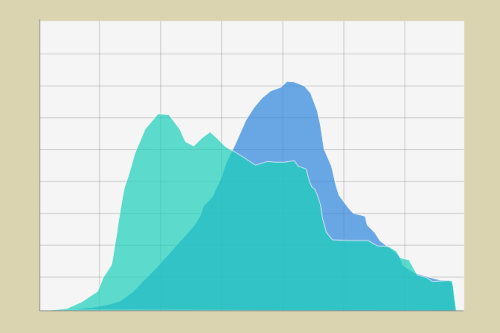
Before diving into the intricacies of the area chart, we first need to understand what it is. In essence, an area chart is a type of plot used in data visualization that displays quantitative data. Familiarizing yourself with different types of data plots, like the area chart, is fundamental to understanding when and how to use them effectively. An area plot, or area chart, is essentially a line plot with the area between the line and the X-axis filled with color or shading. It is a powerful way to visualize the change in one or more quantities over time.
However, the seemingly simple area chart can become quite complex. When visualizing multiple quantities on a single plot, you can have layered area charts, which either stack the areas on top of one another for each category or layer them on the same baseline for comparison. Understanding these variants, their benefits, and their drawbacks is critical for leveraging area charts effectively in your data communication strategies.
This type of visualization offers a plethora of information in a concise and visually appealing manner. By providing a visual representation of data, area charts help to simplify complex information, making it more digestible and more accessible. This can be crucial when making data-driven decisions or presenting information to an audience that may not have the time or expertise to parse dense clusters of data.
The Strengths and Weaknesses of Area Charts
While area charts can be incredibly powerful visualization tools, they can also be a double-edged sword. Like any visualization strategy, they offer distinct benefits but also come with their own set of drawbacks. On the one hand, area charts allow for a dynamic visualization of data changes over time. They intuitively display totals, sums, and differences between parts of a whole, enabling viewers to grasp the bigger trends.
On the flip side, area charts can also obscure data through stacking, which can make it difficult to accurately identify the mid-tier categories’ absolute values. The bottommost area effectively becomes the baseline for the areas on top of it, altering the perception of where zero is. For this reason, it’s often best to reserve area charts for data sets with clear and significant changes over time or between groups.
Moreover, while area charts can illustrate multiple data sets simultaneously, like layered area charts, this, too, can sometimes contribute to confusing visualizations. Viewers may struggle to comprehend individual series due to their overlap and color-coding. The more data sets there are, the more challenging it becomes to distinguish between them. Hence, a careful understanding of these strengths and weaknesses can help you choose where and when to implement this tool.
When to Use Area Charts

By now, you may be itching to integrate area charts into your data visualization arsenal, but it’s crucial to recognize when they can be most effective. Area charts are most beneficial when visualizing multiple related data sets that vary significantly in value. They allow for the comparison of like-for-like data over a specified time period, making them ideal for financial data, inventory studies, or demographic changes.
Before choosing an area chart, it’s important to consider the data itself. If your data sets have similar trends or points that overlap, an area chart may confuse rather than clarify your message. Also, because area charts focus on the cumulative effect, it’s important to ensure that the category items make sense for this type of analysis. Not all categories contribute to a logical whole, and so may not be suitable for a stacked output. Consequently, it is imperative to evaluate the nature and requirements of your data before deciding on an area chart.
Area charts are a powerful data visualization tool that can aid in better understanding data. By visually representing multiple variables or subcategories and showcasing the overall trend, area charts help us to quickly identify patterns, spot outliers, and gain deeper insights. Whether you are presenting sales figures, market trends, or demographic data, using area charts can enhance the clarity and impact of your analysis, making it easier for others to interpret and grasp the key takeaways.